
Sunday 10 April 2011


Evaluation
1. In what ways does your media product use, develop or challenge forms and conventions of real media products?
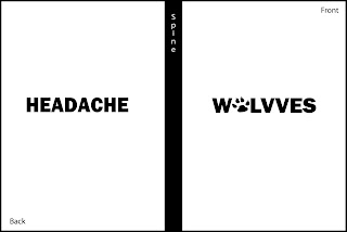
I believe that our music video for the song “Headache” by “Wolvves” uses the forms and conventions of music video seen with most indie rock genres, but challenges the connotations of real media productions. This is because of the montage sequences and multiple locations that we used in it, making it seem conceptual and more artistic, supporting our research into indie rock themes and connotations. This gave us a new creative edge that we, as a group, believed would encourage the band’s success. We avoided a narrative format because we found that to be most commonly used when making music videos, especially in pop genre songs, which our band didn’t fall under. Instead we chose to use more performance styled locations as it made the band seem less ‘labelled’ and more realistic, relating to our target audience.
We tried to use as many camera angles as we could to capture the excitement and adventurous nature of the band, ranging from long shots to extreme close ups to enhance the individuality of each member yet the bond they all have together as a band. The intensity and skill that we tried to show using extreme close ups was supported by the synchronicity of the long shots we used of everyone together, especially when members were playing instruments. Like the Avenged Sevenfold and Sum 41 videos we analysed in our second proposals we were inspired to use P.O.V. shots to show the crowds during one of the bands live gigs to show the audience that their music is enjoyed by others.
The editing methods we used for our music video were far from similar to those of real media products due to the fact that we hardly needed to use continuity editing. The amount of lip and instrument synchronicity we purposely avoided deviated the perfect timing seen within every other music video our audience would be aware of, giving us an almost dominating, artistic edge; great for the vast majority of indie rock fans. Shots were de-saturated to contrast the lighting of other parts and we increased the speed during fractions of the timeline yet had to slow others down to intensify the actions occurring. Nearly every shot will oppose with another, yet harmonizes with it at the same time. It is this contortionist style that has appealed to our audience.
2. How effective is the combination of your main product and ancillary texts?
Our main product was solely based on our subordinate texts to make sure the combination between the two was successful. We used our research to aid in the creating of our music video to make sure that it suited our target audience and genre.
Our primary research texts suggest that our bands theme of Indie Rock would connote them as a band seen different to others; wearing makeup or piercing themselves, but not to the extent of the connotations of those within the rock genre. The members within our band were styled to be “stereotyped” as normal individuals as they wore casual clothing and styled simple haircuts. However, one of the members had his ears pierced and another portrayed a slightly rugged look (with a beard), connoting a more rebellious stereotype, but not one to an extremity.
Other suggestions we researched state that the style of song and music video for an indie rock band would contain multiple attributes of an artistic style yet would not breach into the form of a piece of conceptual material, as some find this style to be confusing and more suitable for a more foreign or techno genre. Most points we learnt about the Indie Rock genre were opinions and preferences showing us how broad the spectrum for this particular style is. We originally understood from our interviews that very controversial videos will be disliked by many but will gain the most publicity, just like the current debates with the ideology of Indie Rock.
Through the learning and understanding of the Indie Rock genre we were able to create our advertisement and Digipak Cover/Insert. Reflecting the edgy, artistic persona of our chosen genre we each came up with designs that were self explanatory for the band - Wolvves. We chose to use traditional media methods when creating the initial images which we then scanned and used Photoshop to further manipulate. We thought that not using a photograph or Clip Art would make our products stand out against real media products.
However we did try to create a very simple yet bold digital at first that used the contrasting tones of Black and White. We figured that this cover would provoke curiosity within our audience but as our band are only starting, we realised that we should be promoting them as much as we could at this stage and show their creativity to excite new audiences.
I believe that our music video for the song “Headache” by “Wolvves” uses the forms and conventions of music video seen with most indie
 rock genres, but challenges the connotations of real media productions. This is because of the montage sequences and multiple locations that we used in it, making it seem conceptual and more artistic, supporting our research into indie rock themes and connotations. This gave us a new creative edge that we, as a group, believed would encourage the band’s success. We avoided a narrative format because we found that to be most commonly used when making music videos, especially in pop genre songs, which our band didn’t fall under. Instead we chose to use more performance styled locations as it made the band seem less ‘labelled’ and more realistic, relating to our target audience.
We tried to use as many camera angles as we could to capture the excitement and adventurous nature of the band, ranging from long shots to extreme close ups to enhance the individuality of each member yet the bond they all have together as a band. The intensity and
 skill that we tried to show using extreme close ups was supported by the synchronicity of the long shots we used of everyone together, especially when members were playing instruments. Like the Avenged Sevenfold and Sum 41 videos we analysed in our second proposals we were inspired to use P.O.V. shots to show the crowds during one of the bands live gigs to show the audience that their music is enjoyed by others.
The editing methods we used for our music video were far from similar to those of real media products due to the fact that we hardly needed to use continuity editing. The amount of lip and instrument synchronicity we purposely avoided deviated the perfect timing seen within every other music video our audience would be aware of, giving us an almost dominating, artistic edge; great for the vast majority of indie rock fans. Shots were de-saturated to contrast the lighting of other parts and we increased the speed during fractions of the timeline yet had to slow others down to intensify the actions occurring. Nearly every shot will oppose with another, yet harmonizes with it at the same time. It is this contortionist style that has appealed to our audience.
2. How effective is the combination of your main product and ancillary texts?
Our main product was solely based on our subordinate texts to make sure the combination between the two was successful. We used our research to aid in the creating of our music video to make sure that it suited our target audience and genre.
Our primary research texts suggest that our bands theme of Indie Rock would connote them as a band seen different to others; wearing makeup or piercing themselves, but not to the extent of the connotations of those within the rock genre. The members within our band were styled to be “stereotyped” as normal individuals as they wore casual clothing and styled simple haircuts. However, one of the members had his ears pierced and another portrayed a slightly rugged look (with a beard), connoting a more rebellious stereotype, but not one to an extremity.
Other suggestions we researched state that the style of song and music video for an indie rock band would contain multiple attributes of an artistic style yet would not breach into the form of a piece of conceptual material, as some find this style to be confusing and more suitable for a more foreign or techno genre. Most points we learnt about the Indie Rock genre were opinions and preferences showing us how broad the spectrum for this particular style is. We originally understood from our interviews that very controversial videos will be disliked by many but will gain the most publicity, just like the current debates with the ideology of Indie Rock.
Through the learning and understanding of the Indie Rock genre we were able to create our advertisement and Digipak Cover/Insert. Reflecting the edgy, artistic persona of our chosen genre we each came up with designs that were self explanatory for the band - Wolvves. We chose to use traditional media methods when creating the initial images which we then scanned and used Photoshop to further manipulate. We thought that not using a photograph or Clip Art would make our products stand out against real media products.
However we did try to create a very simple yet bold digital at first that used the contrasting tones of Black and White. We figured that this cover would provoke curiosity within our audience but as our band are only starting, we realised that we should be promoting them as much as we could at this stage and show their creativity to excite new audiences.
 Our video analyses led us to become inspired greatly when creating our main product. The text we used to explain the detail of each video helped us visualise our own ideas and grow an understanding of what lighting, camera shots, editing techniques, etc, would give our products more promotional success. For example, we were inspired by the diary-like format seen in Sum 41's music video, as well as the P.O.V shots looking onto the crowd that we later on used ourselves.
3. What have you learned from your audience feedback?
From our audience feedback I have learnt that a music video can help promote a band e.g. via YouTube, Facebook, etc, but people may not be encouraged to realise the effort behind the video if they don’t enjoy the song, making it i
 mportant for us to advertise to our target audience. However, our initial research rebuts this view, as it’s through the music video that some songs and bands/musicians become discovered.
The quality and technology used shows the audience an approximate budg
 et, allowing them to be more critical or more sympathetic with their judgement, depending on the person. As we filmed using a Canon XM2 the quality of our video enhanced the quality of our band.
Setting/scenery is more important than I initially thought. Some people enjoyed the shots tha
 t were filmed outside because it made the band seem more open and sociable, helping me understand that a location can input certain connotations onto the band.
Effects put onto shots can sway audience appreciation of the music video too. The shots we turned into monochrome made the music video look more artistic, supporting our research into Indie Rock music ideologies, much to the
 pleasure of some. Yet the colourful lighting of other shots took a selection of others’ interest because they liked how playful and creative a shot could appear, just by adding in some colour.
 I believe most of our feedback was positive and has given me the reassurance that our concept/performance style of music video, involving multiple scenes, lighting and shots, appeals to a greater audience than that stereotypically involved with the genre we originally tried to appeal to. Supporting the forms and conventions of our chosen genre (Indie Rock) whilst challenging the forms and conventions of real media products made our music video unique and created a lot of debate, making the song gain publicity.
4. How did you use new media technologies in the research, planning, construction and evaluation stages?
New media technologies involve better quality cameras and computer software, the use of internet and better sources of research, giving us greater opportunities to promote our music video.
For our research stages I used search engine, via the internet, Google as I knew it would supply me with reliable secondary research. I used Wikipedia when gathering specified and detailed information, nonetheless I made sure that I had my own understanding of the data I researched.
I handed out questionnaires, containing quantitative questions, for the reason that this is the most trustworthy source of information. Quantitative questions gave me easy to analyze, statistically reliable results to, which I used when comparing results with certain age groups or stereo types.
I needed a solid foundation of research so chose to interview a selection of people as well, using qualitative questioning through face to face involvement, as I could note the opinion, attitude and behavior pattern of the individual I was questioning.
When filming our music video we used a Canon XM2 camera which established high quality videos and greater definition when concentrating on certain objects. The audio level indicator was used to distinguish shots from interior locations to exterior. The exposure dial and white balance meter helped us obtain the correct lighting as the harsh natural sunlight differed from the dark and dimly lit pubs at night. As a result of using extreme close ups we used the zoom controller that permitted us to flow between different camera shots and angles whilst filming. Auto focus was used when filming, even though the non-square box position/mode is not suitable for all kinds of lighting, because the fast paced, quick changing shots that were used to accompany the bands characteristic were difficult to manage along with manual focusing. We tried to use as many angles, scenes, movements and camera shots as possible to gain some form of audience’s interest to promote the band Wolvves. During our research we learned that controversy can still be perceived as publicity.
When editing our music video we used Final Cut Pro on a Mac. This program enabled us to log our tape and timeline and capture it to the computer’s internal hard drive. We used the razor tool to cut a preferred shot down to the millisecond, allowing, in our case, perfect discontinuity in addition to giving us the ability to add in effects after filming.
To establish each location we added an after effect to some of them. The inside shots were de-saturated to monochrome, dominating black and white, whilst we increased the vibrancy of the live performances inside to enhance the lighting. Furthermore, I believe we should have used sepia tones for the fast paced, outside, establishing shots as it would have aided the audiences understanding to the use of monochrome shots.
We used jump cut transitions to demonstrate the active personalities of the band as well as display the meaning behind the song, which we later found out from our audience feedback was a successful trait.
To obtain the best possible audio quality we used an mp3 file as opposed to the live recordings that accompanied our performance shots. We had to synchronize the mp3 song file to the video file using the preview viewer box to visually match our shots to the lyrics and used layers to separate the files and match them to our logged timeline. Our completed video needed to be formatted to suit our chosen output (YouTube, DVD, TV, etc) yet compressed if we wished to transfer the video file via USB. We changed the resolution and file format to suit the multiple media formats used today (Quicktime, Windows Media Player, VLC, etc) and took the risk of using more gigabyte space to save a video of greater quality.
When creating our adverts and Digipak Cover/Insert we scanned our traditional media drawings in and manipulated them using Photoshop. This software allowed us to manipulate images together, putting each image into a specific layer and overlapping it with the others to create new and different designs. When creating the Digipak insert I was capable of copying the original JPEG file of the background spiral design to place above and behind the wolf drawings I had created.
I was similarly able to put text and writing over the top of images or around them, in any font and colour to suit what I thought would be necessary to compliment the other designs we agreed on.
I selected a faux brush and lowered the opacity to create the textured background that appears with both light and dark tones of grey whilst I used the Brightness/Contrast adjustment to make the outline of my wolf drawings bolder to stand out against the font.
Access to the internet allowed me to promote our video globally using video websites (e.g. YouTube), blogging websites (e.g. Blogger) and social network sites (e.g. Facebook) by uploading it, allowing public viewing and allowed audiences to freely comment their views and concerns about the music video and spread it to others themselves, promoting the band.
When updating our blog with certain documents, I used the websites Slideshare for .doc files and Slide for multiple .jpg files to create show reels that allowed neat presentation and easy browsing for my audience. I uploaded photos and screen shots from our actual music video to analyse and support, using primary sources, specific statements or opinions from myself or my audience feedback.
Evaluation
1) In what ways does your media product use, develop or challenge forms and conventions of real media products?
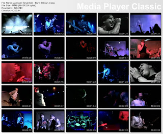
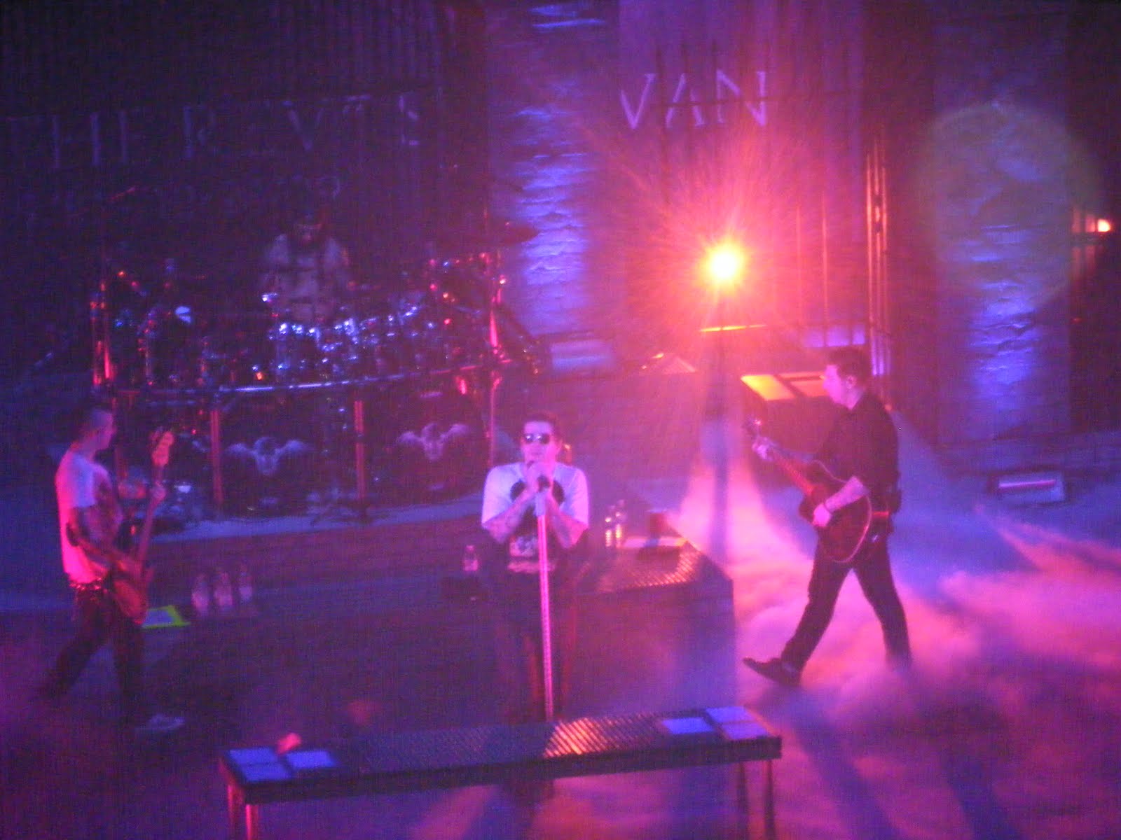
After doing research into our audience and looking at many different professional music videos from the rock/indie genre, we decided to make a video diary of the band and the different gigs that they played and travelled to. We have many different locations within the video as we filmed in Camden Town, which helped to produce interesting fast montage and added more edge to the video. We also shot in two different bars adding more footage for our video log/diary.
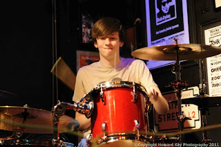

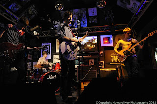
Wolvves band members, showing their personalities and wardrobe at different gigs.

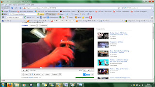
Our music video for the band 'Wolvves' and their song 'headache' fits well with the indie/rock genre playing with some of the typical conventions of this genre, such as drinking, staying out late at pubs and bars and being rebellious, which is also presented in the video, as the video plays with peoples minds and is very out there and confusing for some people. Our video also shows a bit of a twist on the typical conventions as we have fast paced montage and many different location. For example from 2.27 till 2.31 in the video is a classic example of fast montage.
In most of the professional performance videos that we have watch within the indie/rock genre have had a mix of shots from different gigs that they have played with sound checks, interaction between the band and the fans/crowds adding more energy while showing the fans and their dedication to the band. Some of the professional videos also had shots of the different band members hanging around and relaxing with friend, these shots helped to cut up the video.
Using the professional videos as inspiration we decided to make a video which was a video diary of the band and different gigs they played at local bars and up in Glasgow where they performed on the street, sound checks, hanging out, friends and family, and getting ready for different gigs, creating a video which plays with the idea of a video diary mixed with random shots that almost give you a headache. Adding different effects to the video by desaturating some of the shots to show the audience that there has been a change in location and time. In the video you can see the band members and their causal style showing that they are your typical, average guys which makes it easier for the audience to relate to them, as you still see their personalities and passion in their music and performance.

Compared to other bands such as stone sour where frontman Corey Taylor performed in ladies underwear, showing his personality in his wardrobe, performance and stage presents. The Wolvves have a simular fashion sense with other bands in the same rock genre.

After changing the song and the band we decided that the video had to be changed to a more edgy, artistic and energetic piece using different shots of the band performing in different bars and on the street, and mixing this with different shots that were picked up before and after gigs in Camden and Watford, we then managed to get the band performing on the street n Glasgow, which created a very relaxed and refreshing break from all the flashing lights and crowd pleasing performances for the audiences to see the band promoting themselves but also having fun entertaining people on the streets. . During the desaturated parts we show the band doing sound checks and socialising and having drinks with friends before the show. This part was inspired by many different videos where they have desaturated parts of the video to highlight a change of venue or performance, alongside many other elements. This technique is shown in a video from Avenged sevenfold-dear god, where you see the live performance with bright lights and crowds in colour. You also see some of the bizarre moments on the tour bus and in interviews.
http://www.youtube.com/watch?v=mzX0rhF8buo
Screen grabs from the video showing the different shots from the live performances and touring mixed in with fan artwork and different effects.

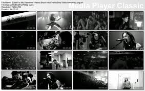
For example bullet for my valentine-hearts burst into fire, which shows the video has been put together using different shots of what the band have been doing on tour such as, getting tattooed, watch home videos, touring the country and performing gigs. The fans were also shot in the video cheering outside venues and inside the crowds which added more energy for the band to vibe off. The video was produced in all black and white, which I think creates a different feel to the video and make the audience pay more attention to detail. This video also inspired me to speed up different shot from our video such as the street performances in Glasgow which added the fact that time was changing, the band were changing, and locations were changing.
http://www.youtube.com/watch?v=0n3cUPTKnl0
Another video that inspired me with the editing was Avenged sevenfold-burn it down, which is a performance video but was edited and made into an interesting and strong music video. All the different shots and angles added and edge to the piece alongside the lighting and colours, which was brought together with different shots of the band members and the energy from the crowds. In the video you see many close ups of the band members individually showing their power/talent.
http://www.youtube.com/watch?v=rNOgvZRzwP4
Screen grabs from the video showing the different shots with the lighting and colour mixed in with the black and white shots.
2) How effective is the combination of your main product and ancillary texts?
We tried to keep the artwork in the theme of edgy, and indie using different techniques and mediums to create the final digipak cover such as fine liners, thick liner pens and Photoshop. I then used some of the different effects to brighten up the piece and add more dept to the drawings creating a realistically 3D piece. The piece I think goes well with the video and we as a group have kept the video and print work within the theme of edgy and indie. I used the text tool in Photoshop to create the text and pick a font that fits well with the piece and the theme. I was influenced by Eric Van Den Boom who is a freelance artist who works in the fields of illustration and graphics. We kept the colour scheme the same throughout the print products so that they will link together and promote the band in a way that is professional and attractive. We used blue and red mostly to link the pieces together. In both the digipak cover and the insert we used crinkled lines and spirograms in blue and red to add detail and continue the theme. Once I showed the digipak to our audience to see what they through about it I was able to finalise the piece and add the smaller details in the background, adding the text, and enhancing the colours. I decided to make a piece which advertised the band in a good way, and so the first thing that you look at when you see the cover is the band’s name, as it is in the foreground and was made plain but bold, so it would catch the attention of the audience. BELOW IS A PIECE FROM ERIC VAN DEN BOOM:
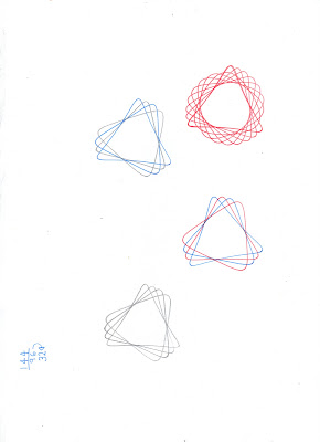
Some spriograms and crinkled lines in booms style, using fine liners.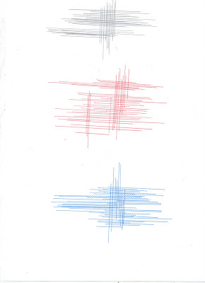 .
.
3) What have you learned from your audience feedback?
Our target audience is 15+ and anyone who is into indie/rock music, both males and females and all ethnicities. We decided that this would be the best audience for our video as most people in this age range use YouTube and may even have their own videos which they have uploaded onto YouTube. We also had to take into consideration the fact that there was alcohol involved/ shown in the video which may not be appropriate for teenagers under the age of 15.
Screen grab from the video once it was uploaded onto youtube, lead singer having a pint.
I used the results from the audience feedback to improve on the video by re-editing parts and adding more edge and creativity to the video, but also kept in mind that the shots had to almost blend into one another and flow. We decided that as we have a young audience that it would be appropriate to create a video which will play with the audiences mind in some parts with the fast montage and all the different locations. I also did a lot of different research on what my audience likes and dislikes as I had questionnaires, in dept interviews, and text analysis of today popular and professional videos, which helped to create a profile for my target audience. This helped us as a group to expand on our ideas and produce a video which was professional.
After filming in two different bars and sitting in on a practise session, we decided to film in Camden at night to pick up some random abstract shot of different lights and signs using different angles to capture some amazing shots which made the video flow and broke it up a bit to show something different. We also then picked up shots in Glasgow of the band performing on the street which worked to our advance to create some interesting shots. The video has a variety of different and creative shots, we played around with the speed and the colours of some of the shots to help the audience see and understand the different locations. We made all the shots from the house/practise session desatuarted making the video a bit easier to watch, giving the audience small breaks from the flashing colours and lights. We put together night and day shots adding contrast throughout the video. We had some more abstract shots such as the light/sun slowly fading away adding a shadow against the buildings.
The feedback I got back from this was that the different speeds helped the video stay with the tempo and that the pops/flashes of colour throughout the video added a strong visual effect to the video and made the piece come together and almost look like a professional video which people could relate to in some way. I was also told that the video fit well with the title of the song which is ‘headache’(link to our video) as all the changes in location and fast montage of different elements messes with the audiences mind and make it hard for them to understand what’s going on. A lot of people who watched the video particularly liked the clips from the street performances as it was abstract with the natural lighting as you can see it fading across the building in the background, this mixed with the speed of the clip created a shot that was artistic but also natural and entertaining.
We were told to be creative and work to the tempo of the music by adding in different and visually strong cut a ways of the band hanging around, drinking, dancing, with friends and family at the pubs and clubs and we even managed to get some shots around and about in Glasgow with the band.
4) How did you use new media technologies in the research, planning, construction and evaluation stages?
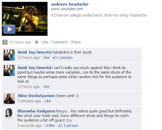
To get some more audience feedback I decided to upload the video on to Facebook to see what peoples reactions would be to the video, so that they could leave comments, using some modern technology to help us improve in future projects and to see what our audience and people our age like about the video. We asked a number of different people to answer our questionnaire within college and outside college who were of different ages and could help us to find out what people in our target audience like and how they would expect the band to be presented in the video.
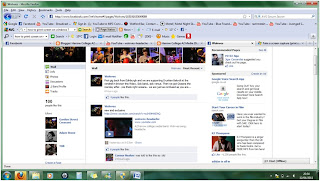
This is a screen grab from the Wolvves offical facebook page after the band had uploaded the video on to their page.
Most of the schools equipment that was used was handy as for the practise/house session we used lighting to enhance the colours or to change the way the shot looked to the audiences. By changing the light the shots would become darker making some interesting shots as we tried to use the small amount of light that was pouring in to the room between the closed curtains. I used final cut pro to do all the editing for the video which was easy to use and make a professional video using some of the different effects and seeing what worked and what didn’t.
Using Photoshop I produced a digipak cover with original drawings which were based on photographs taken at the gigs and wolf images which i got from the internet via Google. I then used Eric Van Den Boom style as inspiration to add detail to the background and to help frame the piece using fine liners, crinkled rules and spirograms. I used many links to YouTube to show examples of different video, which we used as inspiration, creating hyperlinks between the text and videos.
 This is the digipak cover art which was inspired by Eric Van Den Boom style.
After doing research into our audience and looking at many different professional music videos from the rock/indie genre, we decided to make a video diary of the band and the different gigs that they played and travelled to. We have many different locations within the video as we filmed in Camden Town, which helped to produce interesting fast montage and added more edge to the video. We also shot in two different bars adding more footage for our video log/diary.


Wolvves band members, showing their personalities and wardrobe at different gigs.

Our music video for the band 'Wolvves' and their song 'headache' fits well with the indie/rock genre playing with some of the typical conventions of this genre, such as drinking, staying out late at pubs and bars and being rebellious, which is also presented in the video, as the video plays with peoples minds and is very out there and confusing for some people. Our video also shows a bit of a twist on the typical conventions as we have fast paced montage and many different location. For example from 2.27 till 2.31 in the video is a classic example of fast montage.
In most of the professional performance videos that we have watch within the indie/rock genre have had a mix of shots from different gigs that they have played with sound checks, interaction between the band and the fans/crowds adding more energy while showing the fans and their dedication to the band. Some of the professional videos also had shots of the different band members hanging around and relaxing with friend, these shots helped to cut up the video.
Using the professional videos as inspiration we decided to make a video which was a video diary of the band and different gigs they played at local bars and up in Glasgow where they performed on the street, sound checks, hanging out, friends and family, and getting ready for different gigs, creating a video which plays with the idea of a video diary mixed with random shots that almost give you a headache. Adding different effects to the video by desaturating some of the shots to show the audience that there has been a change in location and time. In the video you can see the band members and their causal style showing that they are your typical, average guys which makes it easier for the audience to relate to them, as you still see their personalities and passion in their music and performance.

Compared to other bands such as stone sour where frontman Corey Taylor performed in ladies underwear, showing his personality in his wardrobe, performance and stage presents. The Wolvves have a simular fashion sense with other bands in the same rock genre.

After changing the song and the band we decided that the video had to be changed to a more edgy, artistic and energetic piece using different shots of the band performing in different bars and on the street, and mixing this with different shots that were picked up before and after gigs in Camden and Watford, we then managed to get the band performing on the street n Glasgow, which created a very relaxed and refreshing break from all the flashing lights and crowd pleasing performances for the audiences to see the band promoting themselves but also having fun entertaining people on the streets. . During the desaturated parts we show the band doing sound checks and socialising and having drinks with friends before the show. This part was inspired by many different videos where they have desaturated parts of the video to highlight a change of venue or performance, alongside many other elements. This technique is shown in a video from Avenged sevenfold-dear god, where you see the live performance with bright lights and crowds in colour. You also see some of the bizarre moments on the tour bus and in interviews.
http://www.youtube.com/watch?v=mzX0rhF8buo
Screen grabs from the video showing the different shots from the live performances and touring mixed in with fan artwork and different effects.

For example bullet for my valentine-hearts burst into fire, which shows the video has been put together using different shots of what the band have been doing on tour such as, getting tattooed, watch home videos, touring the country and performing gigs. The fans were also shot in the video cheering outside venues and inside the crowds which added more energy for the band to vibe off. The video was produced in all black and white, which I think creates a different feel to the video and make the audience pay more attention to detail. This video also inspired me to speed up different shot from our video such as the street performances in Glasgow which added the fact that time was changing, the band were changing, and locations were changing.
http://www.youtube.com/watch?v=0n3cUPTKnl0

Another video that inspired me with the editing was Avenged sevenfold-burn it down, which is a performance video but was edited and made into an interesting and strong music video. All the different shots and angles added and edge to the piece alongside the lighting and colours, which was brought together with different shots of the band members and the energy from the crowds. In the video you see many close ups of the band members individually showing their power/talent.
http://www.youtube.com/watch?v=rNOgvZRzwP4
Screen grabs from the video showing the different shots with the lighting and colour mixed in with the black and white shots.

2) How effective is the combination of your main product and ancillary texts?
We tried to keep the artwork in the theme of edgy, and indie using different techniques and mediums to create the final digipak cover such as fine liners, thick liner pens and Photoshop. I then used some of the different effects to brighten up the piece and add more dept to the drawings creating a realistically 3D piece. The piece I think goes well with the video and we as a group have kept the video and print work within the theme of edgy and indie. I used the text tool in Photoshop to create the text and pick a font that fits well with the piece and the theme. I was influenced by Eric Van Den Boom who is a freelance artist who works in the fields of illustration and graphics. We kept the colour scheme the same throughout the print products so that they will link together and promote the band in a way that is professional and attractive. We used blue and red mostly to link the pieces together. In both the digipak cover and the insert we used crinkled lines and spirograms in blue and red to add detail and continue the theme. Once I showed the digipak to our audience to see what they through about it I was able to finalise the piece and add the smaller details in the background, adding the text, and enhancing the colours. I decided to make a piece which advertised the band in a good way, and so the first thing that you look at when you see the cover is the band’s name, as it is in the foreground and was made plain but bold, so it would catch the attention of the audience. BELOW IS A PIECE FROM ERIC VAN DEN BOOM:

Some spriograms and crinkled lines in booms style, using fine liners.
 .
.3) What have you learned from your audience feedback?
Our target audience is 15+ and anyone who is into indie/rock music, both males and females and all ethnicities. We decided that this would be the best audience for our video as most people in this age range use YouTube and may even have their own videos which they have uploaded onto YouTube. We also had to take into consideration the fact that there was alcohol involved/ shown in the video which may not be appropriate for teenagers under the age of 15.

Screen grab from the video once it was uploaded onto youtube, lead singer having a pint.
I used the results from the audience feedback to improve on the video by re-editing parts and adding more edge and creativity to the video, but also kept in mind that the shots had to almost blend into one another and flow. We decided that as we have a young audience that it would be appropriate to create a video which will play with the audiences mind in some parts with the fast montage and all the different locations. I also did a lot of different research on what my audience likes and dislikes as I had questionnaires, in dept interviews, and text analysis of today popular and professional videos, which helped to create a profile for my target audience. This helped us as a group to expand on our ideas and produce a video which was professional.
After filming in two different bars and sitting in on a practise session, we decided to film in Camden at night to pick up some random abstract shot of different lights and signs using different angles to capture some amazing shots which made the video flow and broke it up a bit to show something different. We also then picked up shots in Glasgow of the band performing on the street which worked to our advance to create some interesting shots. The video has a variety of different and creative shots, we played around with the speed and the colours of some of the shots to help the audience see and understand the different locations. We made all the shots from the house/practise session desatuarted making the video a bit easier to watch, giving the audience small breaks from the flashing colours and lights. We put together night and day shots adding contrast throughout the video. We had some more abstract shots such as the light/sun slowly fading away adding a shadow against the buildings.
The feedback I got back from this was that the different speeds helped the video stay with the tempo and that the pops/flashes of colour throughout the video added a strong visual effect to the video and made the piece come together and almost look like a professional video which people could relate to in some way. I was also told that the video fit well with the title of the song which is ‘headache’(link to our video) as all the changes in location and fast montage of different elements messes with the audiences mind and make it hard for them to understand what’s going on. A lot of people who watched the video particularly liked the clips from the street performances as it was abstract with the natural lighting as you can see it fading across the building in the background, this mixed with the speed of the clip created a shot that was artistic but also natural and entertaining.
We were told to be creative and work to the tempo of the music by adding in different and visually strong cut a ways of the band hanging around, drinking, dancing, with friends and family at the pubs and clubs and we even managed to get some shots around and about in Glasgow with the band.

4) How did you use new media technologies in the research, planning, construction and evaluation stages?
To get some more audience feedback I decided to upload the video on to Facebook to see what peoples reactions would be to the video, so that they could leave comments, using some modern technology to help us improve in future projects and to see what our audience and people our age like about the video. We asked a number of different people to answer our questionnaire within college and outside college who were of different ages and could help us to find out what people in our target audience like and how they would expect the band to be presented in the video.

This is a screen grab from the Wolvves offical facebook page after the band had uploaded the video on to their page.
Most of the schools equipment that was used was handy as for the practise/house session we used lighting to enhance the colours or to change the way the shot looked to the audiences. By changing the light the shots would become darker making some interesting shots as we tried to use the small amount of light that was pouring in to the room between the closed curtains. I used final cut pro to do all the editing for the video which was easy to use and make a professional video using some of the different effects and seeing what worked and what didn’t.
Using Photoshop I produced a digipak cover with original drawings which were based on photographs taken at the gigs and wolf images which i got from the internet via Google. I then used Eric Van Den Boom style as inspiration to add detail to the background and to help frame the piece using fine liners, crinkled rules and spirograms. I used many links to YouTube to show examples of different video, which we used as inspiration, creating hyperlinks between the text and videos.
 This is the digipak cover art which was inspired by Eric Van Den Boom style.
Saturday 9 April 2011
Digipak Insert - Final
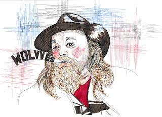
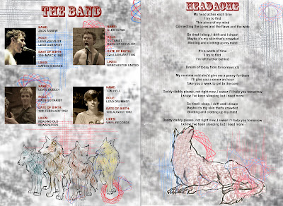 This is my final design for the Digipak Insert that includes information on the band the title and lyrics to the bands main featured song: "Headache". The band information allows the audience to briefly understand each member with the music video feeding them additional information that the insert doesn't give them. A photograph of each member 'in action' promotes the professional ambition that they posess yet a small hint of their interests have been mentioned within their "Likes" section. I contacted each member of the band personally to obtain each element of information I needed as I know primary research is the most reliable. I inserted the image I drew of four wolves to mimic each member of the band and relate them to their name. Each wolf has been shaded and textured using a different colour to make each one unique and I used the spirals and lines as additional background features to match the digipak cover and advert the others have made with the same grey pattern to mould everything together.
The other page contained the lyrics of the bands headline song. I used one of the initial idea sketches I created because the positioning of the wolf compliments the text and background imagery with it, with the wolf appearing to gaze up toward the writing. This will hopefully point the audiences gaze toward the text if they haven't happened to already read it. I used elements from both the digipak cover and magazine advert so all three contained similarities that joined them together, making the audience relate them to each other. The main image (the wolf) was situated at the bottom of the page so I tried not to put too much detail toward the top of the composition, as it would also take away attention from the heading and make the image seem unbalanced.
Digipak Cover - Final

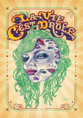
This was the final print of the cover for the digipak which i produced to the theme of indie rock. i kept an edge on the piece by adding the blue and red crinkled line and the spirogram which also helped me to frame the piece and add some more detail to the cover rather than a blank background. I kept the text simple as I wanted the main part to be the drawings and the name of the band which is in bold black pen and in a different style to the rest of the text. At the time of designing we didn't have the full band information so I wasnt able to add any of the other song names, but will be adding the song names later.
Wednesday 6 April 2011
Magazine Advert - Final
 This is my advert design, created in Photoshop. The background was added because I wanted the advert to have a grungy, urban feel - which the text also helps to develop. I edited the colours of the wolf to look like a three-dimensional image in order to disconcert the audience and to portray the feeling of nausea after getting a headache. The main title text looks a little like the text on a Wanted poster that one would see in old Western films - I wanted to create that kind of image for my advert. This also helps it to tie in with Aline's DVD cover.
Development - Sketches for Magazine Advert

 These are the sketches that I produced for use in my advert design. We agreed that we wanted a theme to be shared between the digipak and the advert, so we worked on drawing in a grungy, almost messy style to portray the indie, rock and roll image of the band and also to present a memorable image of the band's name. The images were drawn with fine-liner pens.
Development - Sketches for Digipak Cover
 Using fine liners I added different tones and shades to the wolf. this image was orginally done to go on the back of the cover but after drawing a few different wolves I decided that the second one was much more appropriate to go on the cover. This is my second image below using the same colours, and technique to keep the artistic theme/flow the same.
Subscribe to:
Posts (Atom)