After doing research into our audience and looking at many different professional music videos from the rock/indie genre, we decided to make a video diary of the band and the different gigs that they played and travelled to. We have many different locations within the video as we filmed in Camden Town, which helped to produce interesting fast montage and added more edge to the video. We also shot in two different bars adding more footage for our video log/diary.
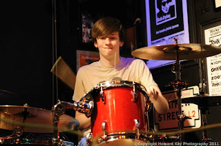

Wolvves band members, showing their personalities and wardrobe at different gigs.

Our music video for the band 'Wolvves' and their song 'headache' fits well with the indie/rock genre playing with some of the typical conventions of this genre, such as drinking, staying out late at pubs and bars and being rebellious, which is also presented in the video, as the video plays with peoples minds and is very out there and confusing for some people. Our video also shows a bit of a twist on the typical conventions as we have fast paced montage and many different location. For example from 2.27 till 2.31 in the video is a classic example of fast montage.
In most of the professional performance videos that we have watch within the indie/rock genre have had a mix of shots from different gigs that they have played with sound checks, interaction between the band and the fans/crowds adding more energy while showing the fans and their dedication to the band. Some of the professional videos also had shots of the different band members hanging around and relaxing with friend, these shots helped to cut up the video.
Using the professional videos as inspiration we decided to make a video which was a video diary of the band and different gigs they played at local bars and up in Glasgow where they performed on the street, sound checks, hanging out, friends and family, and getting ready for different gigs, creating a video which plays with the idea of a video diary mixed with random shots that almost give you a headache. Adding different effects to the video by desaturating some of the shots to show the audience that there has been a change in location and time. In the video you can see the band members and their causal style showing that they are your typical, average guys which makes it easier for the audience to relate to them, as you still see their personalities and passion in their music and performance.
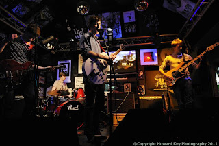

Compared to other bands such as stone sour where frontman Corey Taylor performed in ladies underwear, showing his personality in his wardrobe, performance and stage presents. The Wolvves have a simular fashion sense with other bands in the same rock genre.

After changing the song and the band we decided that the video had to be changed to a more edgy, artistic and energetic piece using different shots of the band performing in different bars and on the street, and mixing this with different shots that were picked up before and after gigs in Camden and Watford, we then managed to get the band performing on the street n Glasgow, which created a very relaxed and refreshing break from all the flashing lights and crowd pleasing performances for the audiences to see the band promoting themselves but also having fun entertaining people on the streets. . During the desaturated parts we show the band doing sound checks and socialising and having drinks with friends before the show. This part was inspired by many different videos where they have desaturated parts of the video to highlight a change of venue or performance, alongside many other elements. This technique is shown in a video from Avenged sevenfold-dear god, where you see the live performance with bright lights and crowds in colour. You also see some of the bizarre moments on the tour bus and in interviews.
http://www.youtube.com/watch?v=mzX0rhF8buo
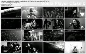
Screen grabs from the video showing the different shots from the live performances and touring mixed in with fan artwork and different effects.

For example bullet for my valentine-hearts burst into fire, which shows the video has been put together using different shots of what the band have been doing on tour such as, getting tattooed, watch home videos, touring the country and performing gigs. The fans were also shot in the video cheering outside venues and inside the crowds which added more energy for the band to vibe off. The video was produced in all black and white, which I think creates a different feel to the video and make the audience pay more attention to detail. This video also inspired me to speed up different shot from our video such as the street performances in Glasgow which added the fact that time was changing, the band were changing, and locations were changing.
http://www.youtube.com/watch?v=0n3cUPTKnl0
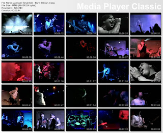
Another video that inspired me with the editing was Avenged sevenfold-burn it down, which is a performance video but was edited and made into an interesting and strong music video. All the different shots and angles added and edge to the piece alongside the lighting and colours, which was brought together with different shots of the band members and the energy from the crowds. In the video you see many close ups of the band members individually showing their power/talent.
http://www.youtube.com/watch?v=rNOgvZRzwP4
Screen grabs from the video showing the different shots with the lighting and colour mixed in with the black and white shots.
2) How effective is the combination of your main product and ancillary texts?
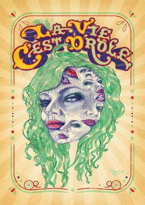
We tried to keep the artwork in the theme of edgy, and indie using different techniques and mediums to create the final digipak cover such as fine liners, thick liner pens and Photoshop. I then used some of the different effects to brighten up the piece and add more dept to the drawings creating a realistically 3D piece. The piece I think goes well with the video and we as a group have kept the video and print work within the theme of edgy and indie. I used the text tool in Photoshop to create the text and pick a font that fits well with the piece and the theme. I was influenced by Eric Van Den Boom who is a freelance artist who works in the fields of illustration and graphics. We kept the colour scheme the same throughout the print products so that they will link together and promote the band in a way that is professional and attractive. We used blue and red mostly to link the pieces together. In both the digipak cover and the insert we used crinkled lines and spirograms in blue and red to add detail and continue the theme. Once I showed the digipak to our audience to see what they through about it I was able to finalise the piece and add the smaller details in the background, adding the text, and enhancing the colours. I decided to make a piece which advertised the band in a good way, and so the first thing that you look at when you see the cover is the band’s name, as it is in the foreground and was made plain but bold, so it would catch the attention of the audience. BELOW IS A PIECE FROM ERIC VAN DEN BOOM:
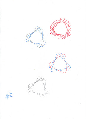
Some spriograms and crinkled lines in booms style, using fine liners.
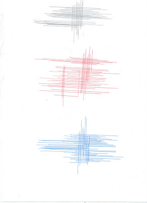 .
.3) What have you learned from your audience feedback?
Our target audience is 15+ and anyone who is into indie/rock music, both males and females and all ethnicities. We decided that this would be the best audience for our video as most people in this age range use YouTube and may even have their own videos which they have uploaded onto YouTube. We also had to take into consideration the fact that there was alcohol involved/ shown in the video which may not be appropriate for teenagers under the age of 15.
Screen grab from the video once it was uploaded onto youtube, lead singer having a pint.
I used the results from the audience feedback to improve on the video by re-editing parts and adding more edge and creativity to the video, but also kept in mind that the shots had to almost blend into one another and flow. We decided that as we have a young audience that it would be appropriate to create a video which will play with the audiences mind in some parts with the fast montage and all the different locations. I also did a lot of different research on what my audience likes and dislikes as I had questionnaires, in dept interviews, and text analysis of today popular and professional videos, which helped to create a profile for my target audience. This helped us as a group to expand on our ideas and produce a video which was professional.
After filming in two different bars and sitting in on a practise session, we decided to film in Camden at night to pick up some random abstract shot of different lights and signs using different angles to capture some amazing shots which made the video flow and broke it up a bit to show something different. We also then picked up shots in Glasgow of the band performing on the street which worked to our advance to create some interesting shots. The video has a variety of different and creative shots, we played around with the speed and the colours of some of the shots to help the audience see and understand the different locations. We made all the shots from the house/practise session desatuarted making the video a bit easier to watch, giving the audience small breaks from the flashing colours and lights. We put together night and day shots adding contrast throughout the video. We had some more abstract shots such as the light/sun slowly fading away adding a shadow against the buildings.
The feedback I got back from this was that the different speeds helped the video stay with the tempo and that the pops/flashes of colour throughout the video added a strong visual effect to the video and made the piece come together and almost look like a professional video which people could relate to in some way. I was also told that the video fit well with the title of the song which is ‘headache’(link to our video) as all the changes in location and fast montage of different elements messes with the audiences mind and make it hard for them to understand what’s going on. A lot of people who watched the video particularly liked the clips from the street performances as it was abstract with the natural lighting as you can see it fading across the building in the background, this mixed with the speed of the clip created a shot that was artistic but also natural and entertaining.
We were told to be creative and work to the tempo of the music by adding in different and visually strong cut a ways of the band hanging around, drinking, dancing, with friends and family at the pubs and clubs and we even managed to get some shots around and about in Glasgow with the band.
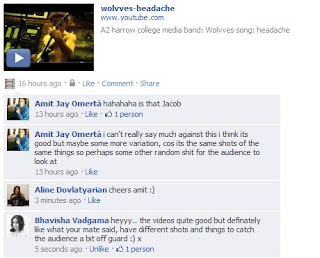
4) How did you use new media technologies in the research, planning, construction and evaluation stages?
To get some more audience feedback I decided to upload the video on to Facebook to see what peoples reactions would be to the video, so that they could leave comments, using some modern technology to help us improve in future projects and to see what our audience and people our age like about the video. We asked a number of different people to answer our questionnaire within college and outside college who were of different ages and could help us to find out what people in our target audience like and how they would expect the band to be presented in the video.
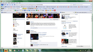
This is a screen grab from the Wolvves offical facebook page after the band had uploaded the video on to their page.
Most of the schools equipment that was used was handy as for the practise/house session we used lighting to enhance the colours or to change the way the shot looked to the audiences. By changing the light the shots would become darker making some interesting shots as we tried to use the small amount of light that was pouring in to the room between the closed curtains. I used final cut pro to do all the editing for the video which was easy to use and make a professional video using some of the different effects and seeing what worked and what didn’t.
Using Photoshop I produced a digipak cover with original drawings which were based on photographs taken at the gigs and wolf images which i got from the internet via Google. I then used Eric Van Den Boom style as inspiration to add detail to the background and to help frame the piece using fine liners, crinkled rules and spirograms. I used many links to YouTube to show examples of different video, which we used as inspiration, creating hyperlinks between the text and videos.
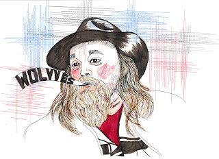 This is the digipak cover art which was inspired by Eric Van Den Boom style.
No comments:
Post a Comment