
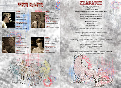
 This is my final design for the Digipak Insert that includes information on the band the title and lyrics to the bands main featured song: "Headache". The band information allows the audience to briefly understand each member with the music video feeding them additional information that the insert doesn't give them. A photograph of each member 'in action' promotes the professional ambition that they posess yet a small hint of their interests have been mentioned within their "Likes" section. I contacted each member of the band personally to obtain each element of information I needed as I know primary research is the most reliable. I inserted the image I drew of four wolves to mimic each member of the band and relate them to their name. Each wolf has been shaded and textured using a different colour to make each one unique and I used the spirals and lines as additional background features to match the digipak cover and advert the others have made with the same grey pattern to mould everything together.
The other page contained the lyrics of the bands headline song. I used one of the initial idea sketches I created because the positioning of the wolf compliments the text and background imagery with it, with the wolf appearing to gaze up toward the writing. This will hopefully point the audiences gaze toward the text if they haven't happened to already read it. I used elements from both the digipak cover and magazine advert so all three contained similarities that joined them together, making the audience relate them to each other. The main image (the wolf) was situated at the bottom of the page so I tried not to put too much detail toward the top of the composition, as it would also take away attention from the heading and make the image seem unbalanced.


 This image was an initial idea for a simple logo; something with the ability to modify and manipulate text around i.e. the name of the band. However, we all agreed that this image didn’t represent the band properly and a more clearer image of a wolf should be drawn to create a more attractive image for the audience to be drawn to.
  This image was created to depict a clearer image of a wolf. I trued to make position the wolf into something unique and something that makes the product seem more humorous. But the image was determined too complicated to be placed with text and not original enough to stand out.

 I created this image to try and portray the band through their name. There are four members of the band, so I drew four wolves. Each wolf is different (although more difficult to see in a black and white image), reflecting the uniqueness of each member, yet when all put together they create a harmony; a whole. We agreed that this image could possible be successful, but only for other merchandise possibilities, not for the actual digipak colver or magazine advertisement.

 The last two wolves I drew were designed to fit what we wanted as a group. The realism of each wolf creates a dynamic impact on audiences and makes it clear what the image is trying to represent. I chose to do both wolves completely different so it was possible for us to use either one (or both) depending on what we wanted.